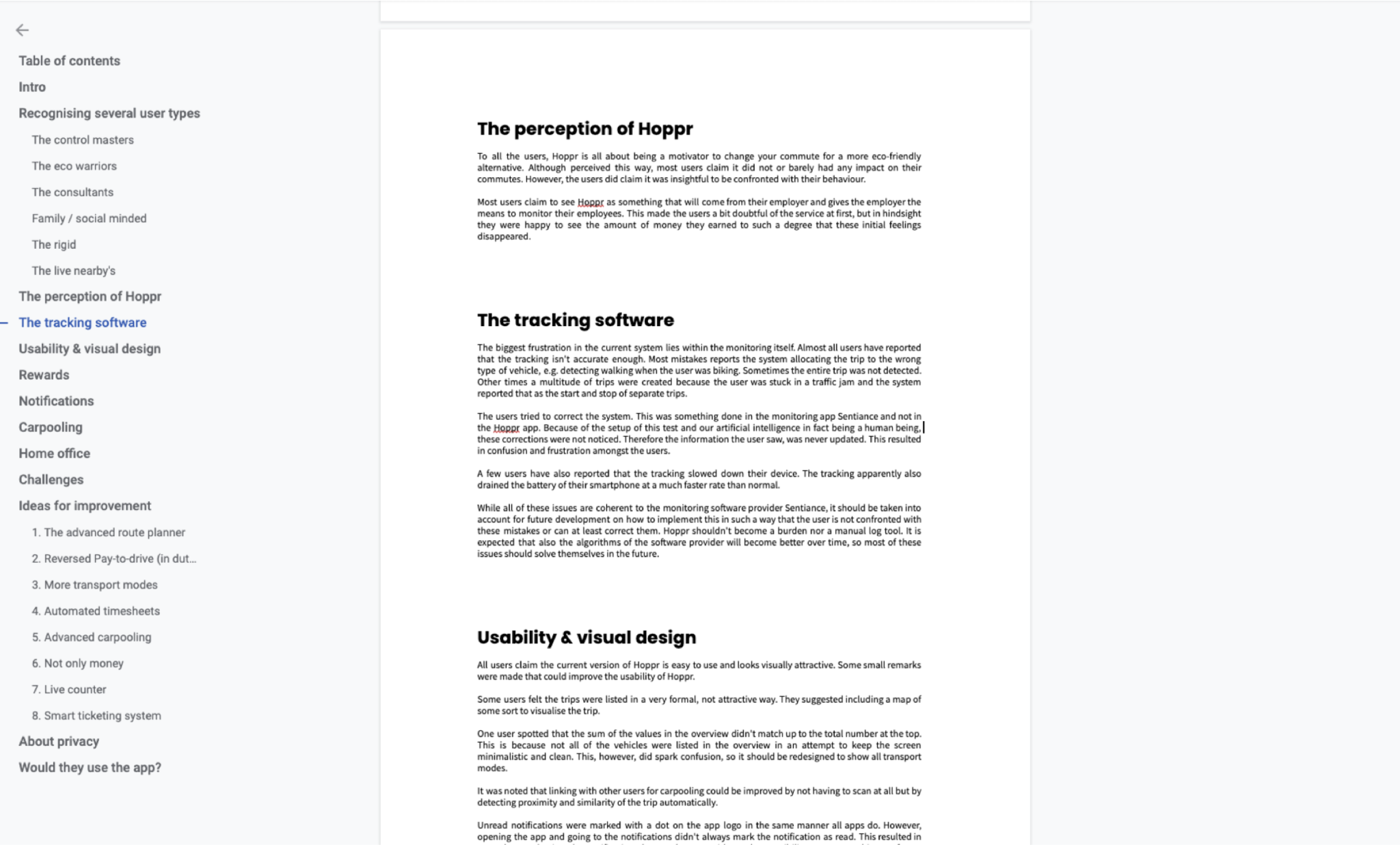
A gamification app that rewards using greener ways of transport
Client: EY - My role: UX Designer / UX Researcher - Date: 2018-2019

Together with Bagaar (Verhaert Digital), I designed a mobility app for a new startup (powered by EY) to promote alternative ways of commuting. The goal of the project was to validate whether people would be interested in such an app and whom it could serve. The focus is on B2B and letting employees use the app.
Design rationale
EY had lined up 3 corporations with which we conducted 3 focus group interviews to get a grasp of the kind of users there might be. This research focussed on the why and how they’re currently commuting and what is needed to make a change to their commute. Together with stakeholders, we used this input to create wireflows. After a few iteration cycles, we defined what would be MVP and defined a test to validate the concept of the app. We ran a Wizard of Oz experiment where we faked the algorithm and logic behind the app so the users perceived it as working. We ran the test for one month. In the meantime, we designed the rest of the app in UI design in more detail. Afterward, we facilitated interviews with participants to gather their feedback. We’ve completed our project with a report and our advice in moving forward.
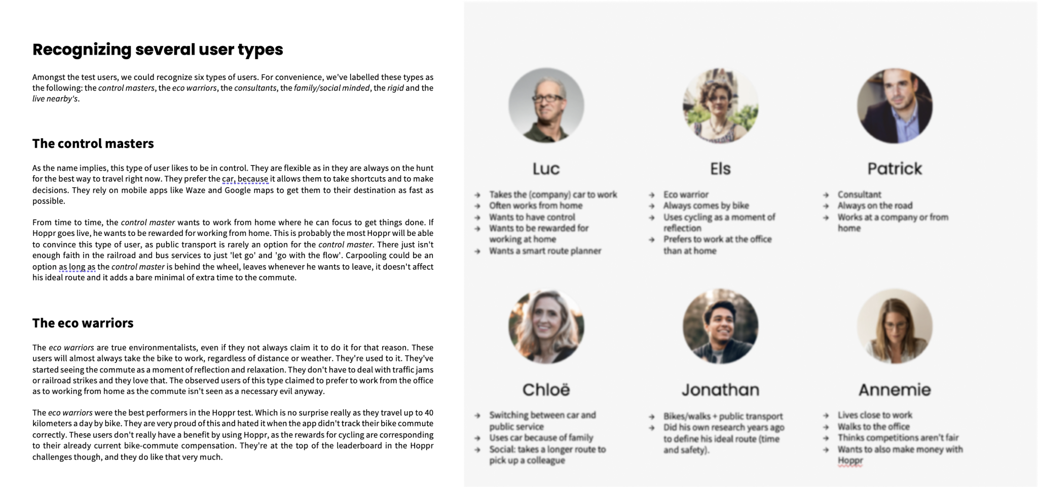
User research & Personas
Organised and hosted focus groups with employees from EY and two of their clients. Out of these conversation, I was able to identify six user types and map out each persona’s needs, wants and behaviour.
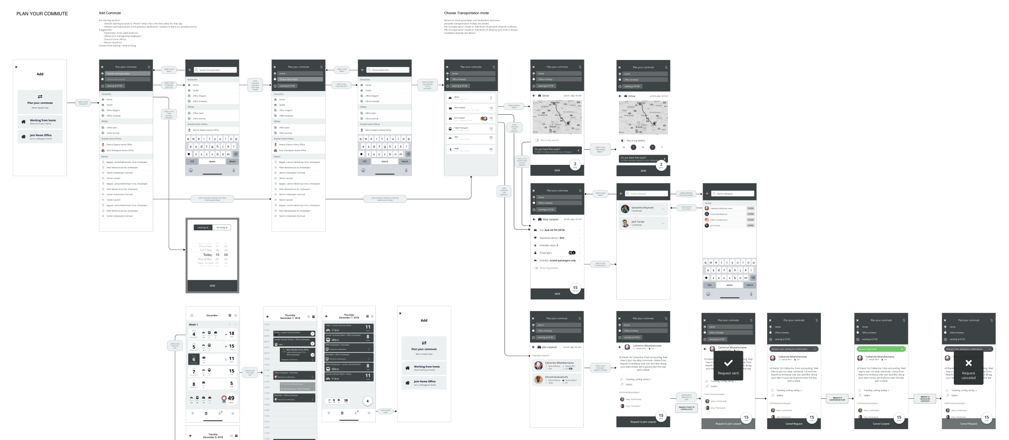
Wireflows
Together with a UX lead, I created wireflows: a combination of wireframes and flowcharts. This document went through various iteration cycles but you could identify three big versions. Each major version was presented to a board of directors and discussed. The minor versions involved feedback from the project team. The following image shows the wireflow of the “Plan your commute” feature.
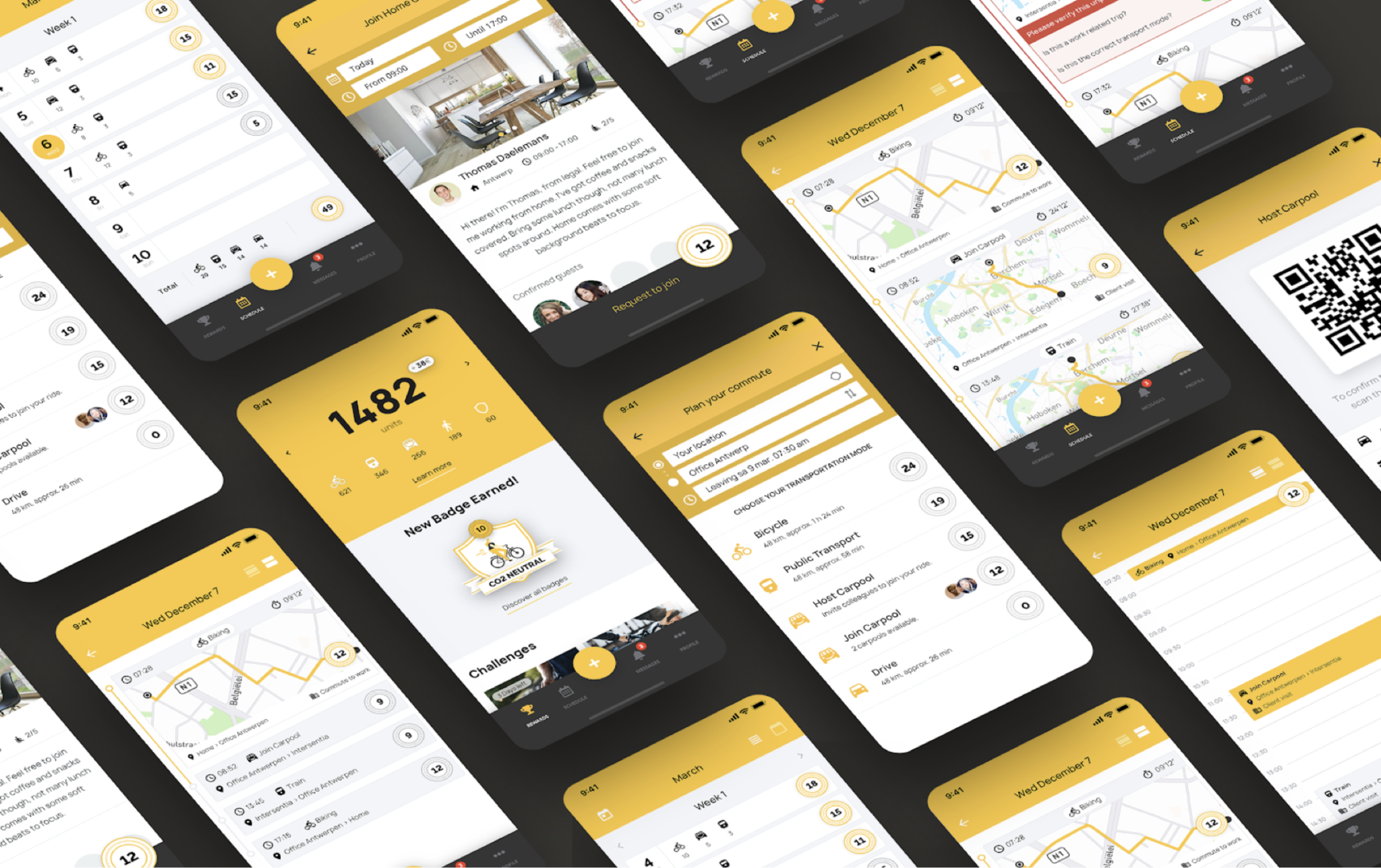
Branding, UI & Design System
I supported the creation of the UI. Several versions were created but in the end it was chosen to keep the branding close to the identity of EY, the mother company.
Wizard of Oz experiment
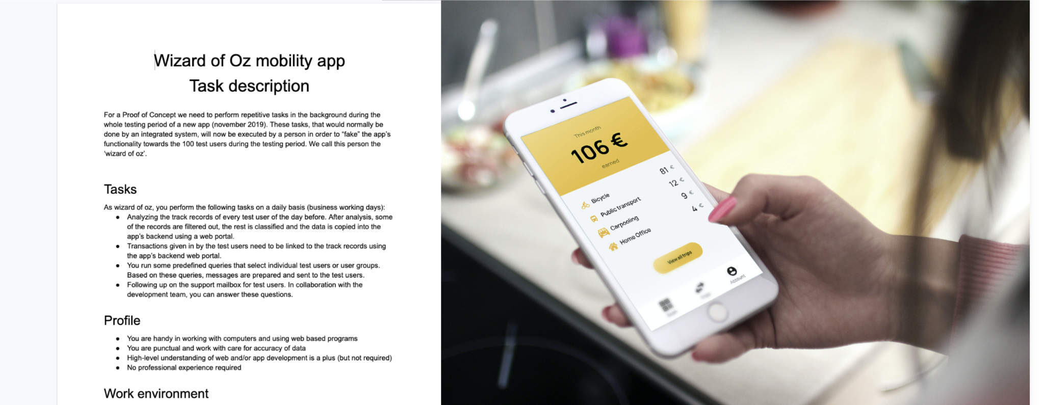
Because the app is relying to data tracking and an AI to interpret that data on the fly, we needed a clever solution to validate this concept without going heavy overboard in development right away. Therefore I set up a Wizard of Oz experiment. In such an experiment, the algorithm behind the app is actually a human being. The user doesn’t know this and the cleverness of the app is faked. This way we could test the app in a realistic way without having to spend an enormous amount of time in building the logic. We created the frontend and hooked it up to a small backend for the Wizard to use. The wizard themselves was an payed intern that we briefed in detail how to react.
Concept evaluation
After the Wizard of Oz experiment, I conducted user interviews with the 40 participants of the test. I documented their findings in a final report together with all of the user research and advice on how to proceed. There were some major issues with the concept, mostly around privacy, feelings of unfairness and the lack of convincing power of the rewards (they would get some discount in an online employee shop). Because of these insights and after several discussions with the board, it was decided to not continue working on this concept.